Designing for Piply: The Healthy Food Co.
Over the past 3 months, I've been working closely with the founders of a new, healthy dinner on-demand service in Dublin City Centre. It has been an amazing project and I thought it would be a good idea to write up my experience and process of working with Piply.
The company & product
Piply is a healthy food company based in Dublin City Centre. Their web app enables users to create an order of delicious and nutritious, chef-crafted meals and have it delivered to their home, work, or wherever they may be.
I was approached by Alexander Gartland (Co-Founder) in March 2016 and we began discussing what the project was all about — what the MVP was, and had a high-level discussion on his vision for the visual direction of Piply. After our meetings, I was hooked and wanted to be a part of it.
Being able to design a product that was going to bring nutritious and healthy food to people was a massive inspiration. Another motivational factor was Alex's passion for wanting to make this company a success. An important factor — and something that really got me excited — was how much Alex and his co-founders care about design. I was delighted to be put in a position where I could help drive it.
Project goals & objectives
The main goals and objectives for this project were:
- Get customers instantly engaged and build understanding of the product
- Create a simple, easy-to-use web app to allow users to create food orders
- Be transparent about meal information, nutritional value, and ingredients
- Design with a mobile-first approach to cater for people on the go
- Progress the visual identity, create a design language, and build a component library
User experience
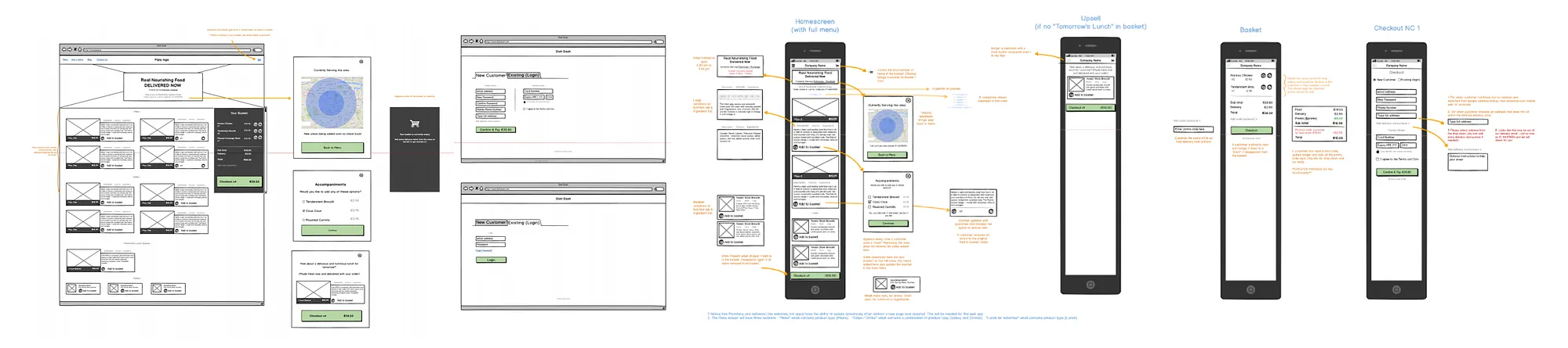
Before I joined the project, Alex and Paul Murphy (Design Manager at CurrencyFair) had already fleshed out the journey map, screen flows, and wireframes — so I could start thinking about how the menu listing should be displayed, first on mobile and then scaling to desktop.
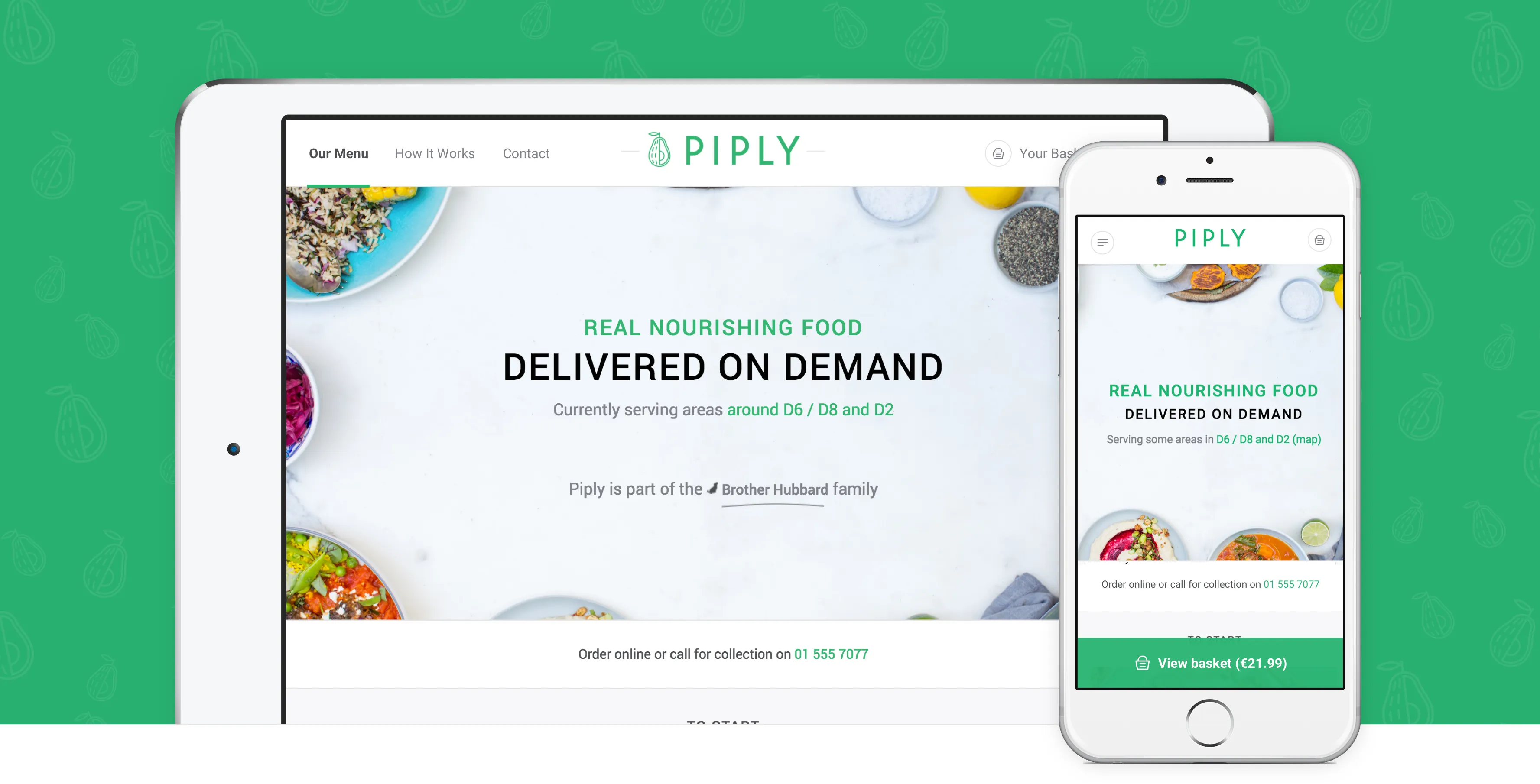
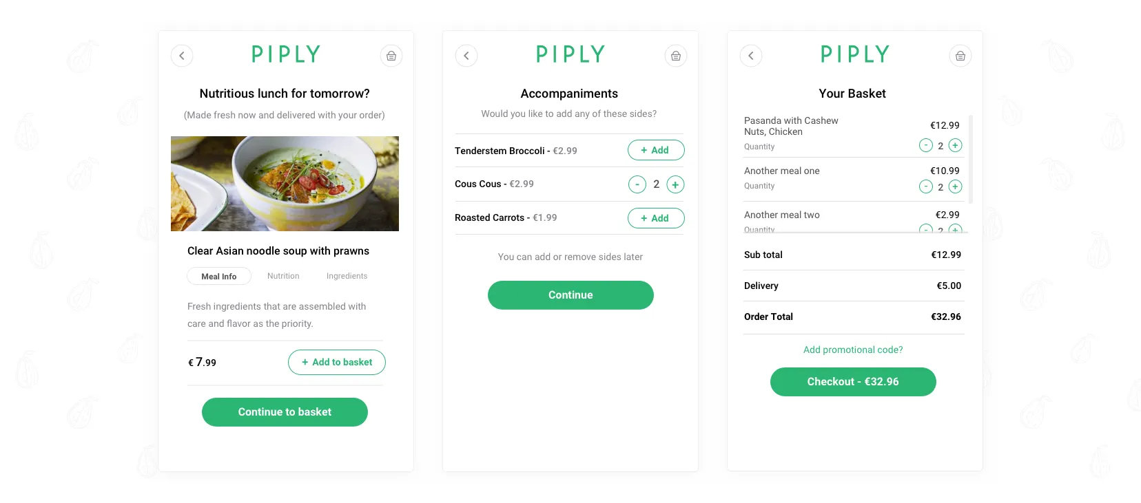
I was working with great content from the very start: meal descriptions, nutritional values, and ingredient listings. To display this content in the best way possible, it was clear that menu items should be stacked rather than side by side. This allows the user to focus on one meal at a time while scrolling, and gives each meal card enough space for its content. The basket and checkout button would always be visible on the right-hand side (sticky on scroll), so the height of the menu was never going to be an issue.
User interface
My key role while working on Piply was to progress the visual identity and create a design language. Branding was already in progress before I joined, and once completed, I started building the design — staying true to Piply's visual identity throughout.
Piply qualities
There were three key qualities I wanted to be at the forefront of the design:
- The freshness of the company
- The healthiness of the product
- The happiness you get from being healthy
Every element — the imagery, the colour of the strokes, the icons on the meal cards — had to adhere to these key qualities.
Key principles
Keeping those qualities at the forefront, I also had to make sure I was sticking to core UI principles throughout:
- Clarity of the design
- Flexibility of the system
- Consistency and structure
- Familiarity and efficiency
Colours
Piply's branding is totally fitting with the company ethos — it's fresh, and it evokes happiness and healthiness. Healthy greens, natural yellows, cloud greys and crisp whites make up the Piply palette.
I used greys for backgrounds, whites for layouts, greens for main calls to action, and yellows for secondary actions.
Typography
Roboto was included in the branding — a modern font with great cross-browser compatibility. There was good variation to choose from: Thin, Light, Regular, Medium, and Bold.
Tone of voice
I wanted the tone of voice in the designs to match the product — healthy, happy and fresh. By using friendly, welcoming messaging (and some emojis here and there), we brought the Piply qualities into the copy itself, helping customers understand and enjoy the product more.
Imagery
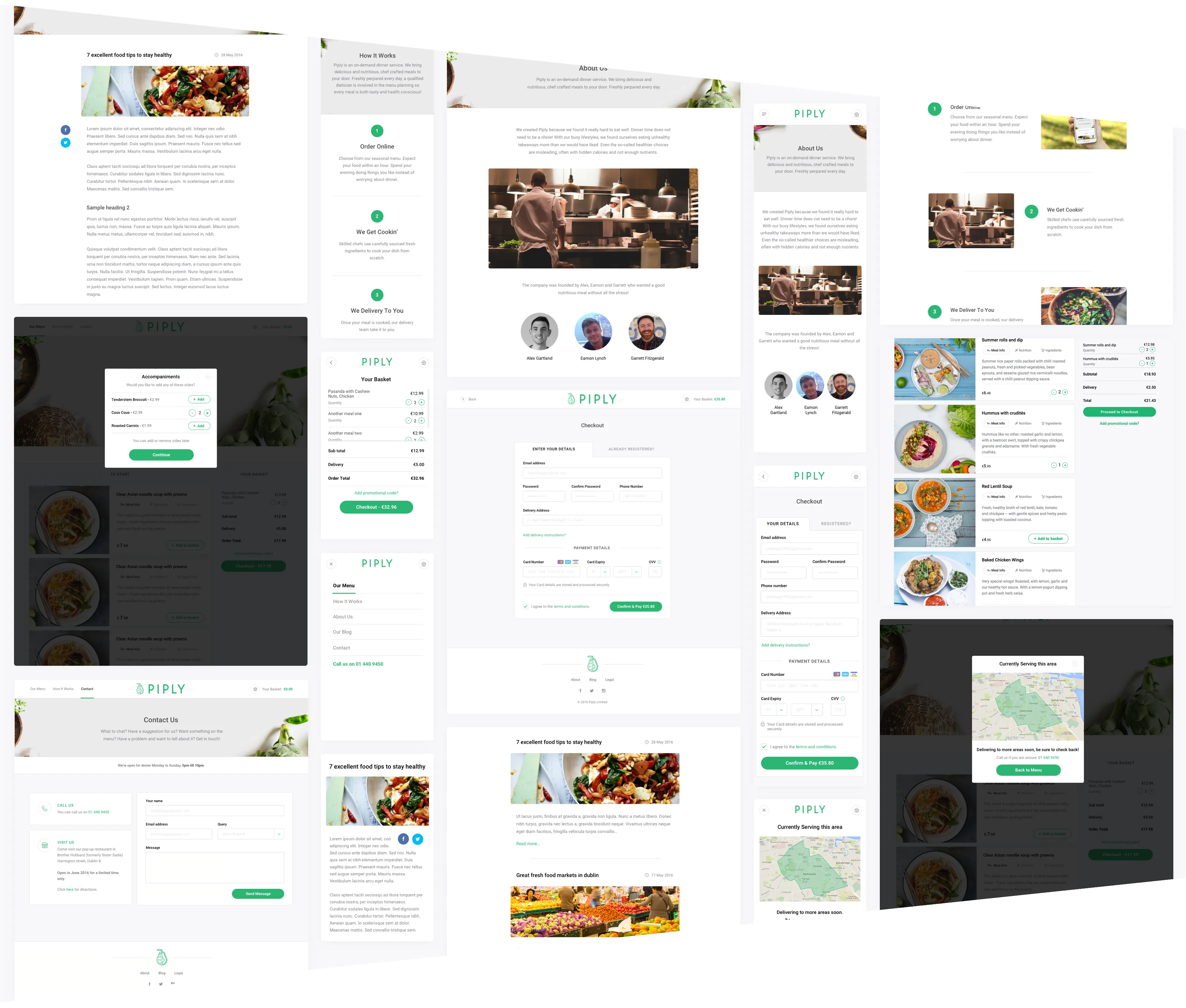
Imagery is key to Piply. Everything is about the food. When discussing imagery, it was essential to portray the deliciousness and nutritiousness of the meals in the best way possible. Imagery is used throughout the site: the hero banners, the menu, and the blog.
Designing the component library
After getting a real understanding of Piply's key qualities and principles, I started designing the component library from which the web app would be built — repeatable, flexible components that could handle different types of content and always be fully responsive.
Having a component library brings clarity and consistency to what's being built. We had to look at the system as a whole and not just as a single page.
After the core elements were created, I moved on to headers and footers, meal cards, baskets, forms, hero banner styles, layouts, modals, and the various states needed for each component.
After multiple revisions, we finalised the design in June 2016 for the MVP — with a design library ready to scale whenever that time comes.
The launch
Since launch, orders have been flying in and customers are really loving the product. When you hear feedback like "Site is slick, food was delish", "Such a nice dinner, compliments to the chefs", and "Nearly ate my phone looking at the pictures" — you know you're on the right track.
Piply received shoutouts from Eir Business, The Irish Times, LovinDublin and Totally Dublin, generating a massive boost in public interest.