Innerstrength - A Redesign Case Study
Innerstrength Health is a HealthTech company on a mission to enable healthcare professionals to deliver tailored self-management exercise and education programmes to their patients and support them remotely.
These programmes guide the patient in the management of their condition and rehabilitation, ultimately resulting in healthier outcomes for patients and an improved patient experience.
They approached me earlier this year with a number of problems they were trying to solve, with the key goal of improving the overall user experience across both patient and healthcare provider apps.
About their products
Innerstrength Health have two apps — TickerFit & Hacka Health.
TickerFit supports patients in both the primary and secondary prevention of cardiovascular disease in primary care and general practice. It has been deployed to enable health professionals deliver bespoke programmes of physical activity to patients who are at risk of developing cardiovascular disease.
Hacka Health has been developed to support children and young people living with long-term conditions including CF (Cystic Fibrosis). The platform enables children and young people take control of their health care while being supported by their healthcare team and parents/guardians via the technology.
Using web and smartphone-based technologies, the platform incorporates a dashboard for health professionals, and smartphone applications (Android and iOS) for patients. The technology acts as a conduit for information between a health professional and patient and as such has multiple beneficial applications.
Project goals & objectives
The Innerstrength team approached me with a number of problems and goals: to help improve the overall user experience across both patient and health care provider apps, discover more ways to engage users, and to establish a new visual direction for the brand and their apps.
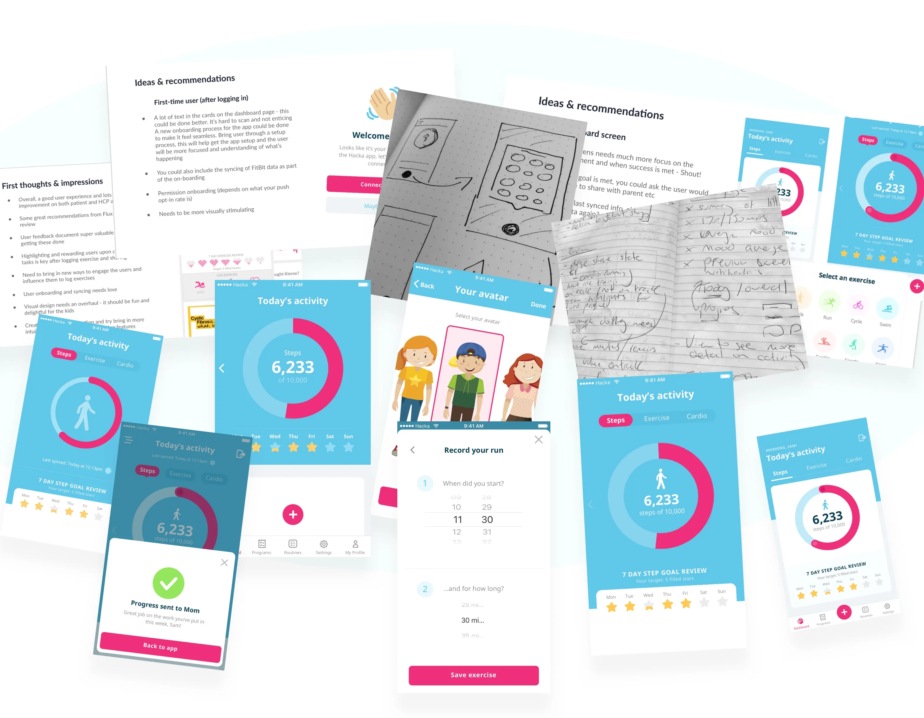
Prior to work kicking off, the team had already collected direct user feedback which highlighted a number of issues that we directed our focus on:
- Daily routines — The setting up of daily routines took a lot longer than necessary, resulting in lack of uptake of the feature
- In-app feedback & recognition — Most users had received no feedback or recognition within the app when they submitted their routine progress or exercise
- Engagement — Users were not actively or continuously engaging with the app over time
- Data syncing — Users did not know when the app had last synced with their wearable devices
- Low quality visual design — Users found the visual design a bit boring in comparison to other apps they were using daily
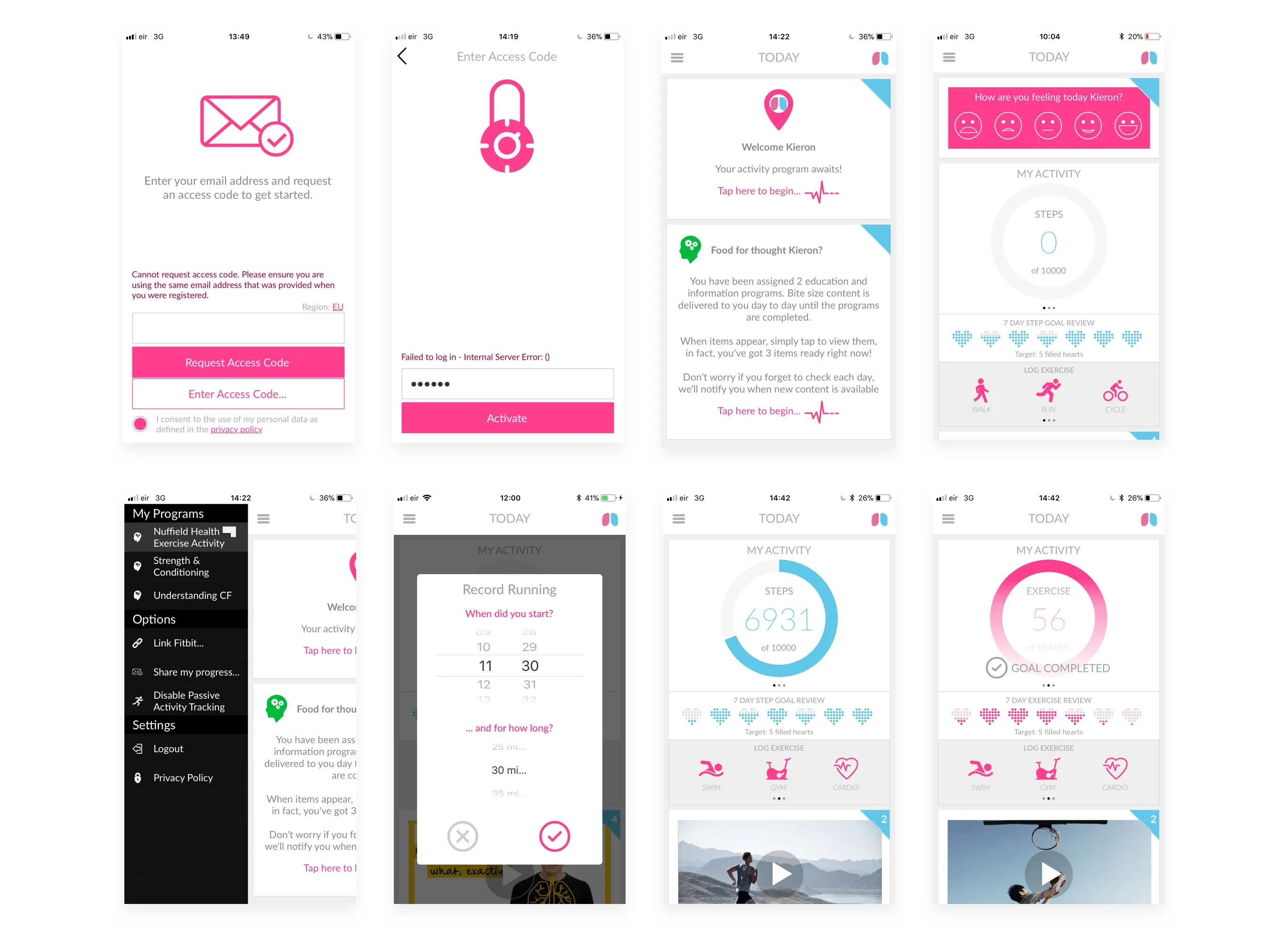
The user experience
During the discovery phase, I dissected all parts of the app to gain an understanding of its function and also of the general usability and UX patterns throughout.
I conceived various improvements that could help simplify general navigation, discovered ways to speed up creating routines and logging exercises, and identified the areas that could be personalised to the user.
I also pushed forward the restructuring of the information architecture so that the new flows could be simple and cohesive, while updating the dashboard so users can quickly and easily access key areas of the app and see what's new.
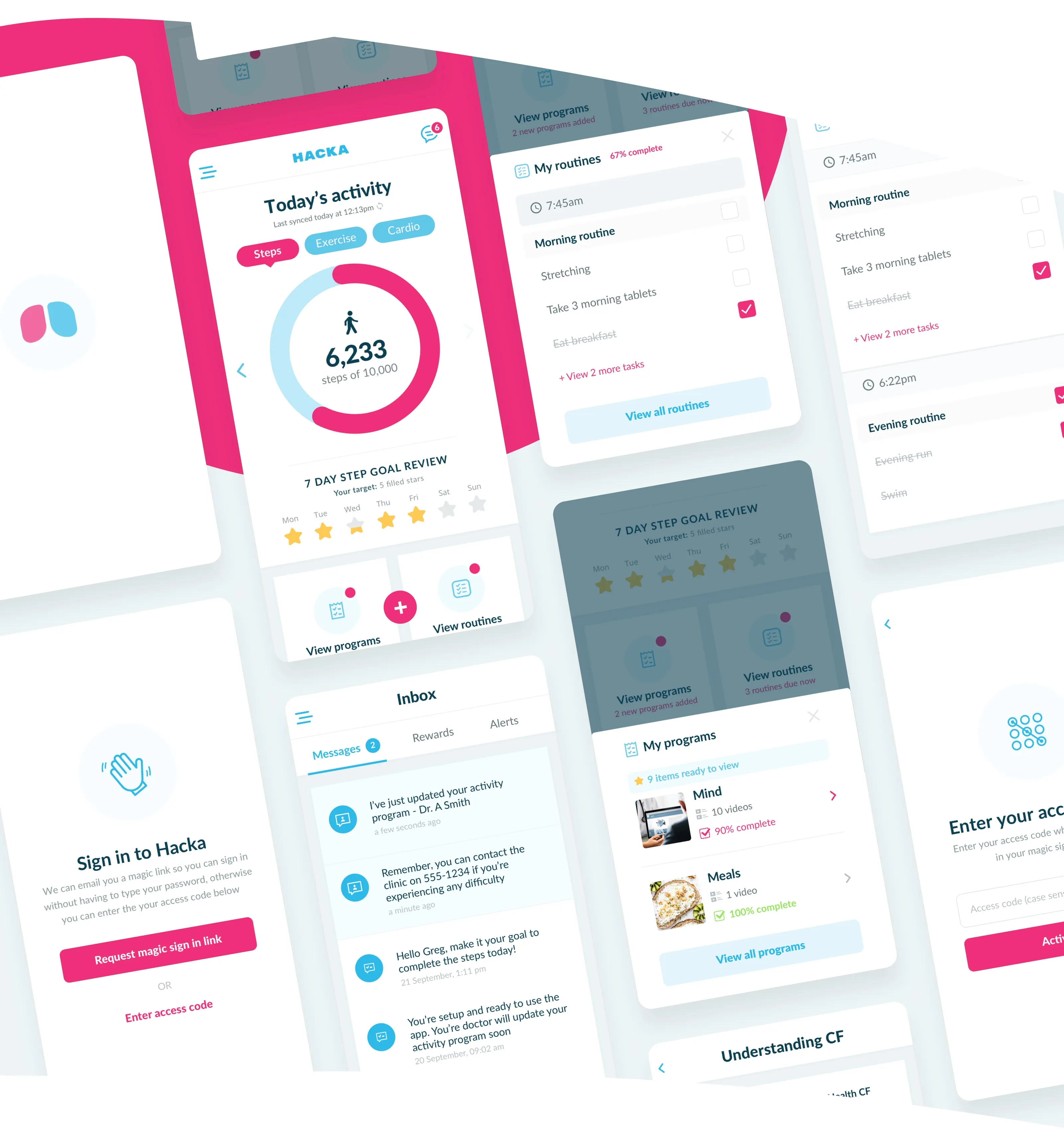
In terms of user engagement, we floated the idea of a points system, played with avatars, badges, and reward unlocks. We also utilised an existing messaging system to create a new inbox feature which would allow users to interact with their healthcare provider and/or parents & guardians.
The user interface
One of our key goals for the project was to establish a new visual design and introduce a new design language that could flow throughout all apps. We also wanted to revamp the brand — bringing it to the next level while staying true to the original.
Some of the key characteristics I constantly asked myself when working on the interface:
- Is it caring & supportive?
- Does it feel friendly and approachable?
- How compassionate is it towards users?
It's always key that you identify what qualities you want your users to feel when using your app — and you can achieve this through the visual design.
Over many iterations, we tweaked many styles to see what could work. Light contrast design all the way through dark contrast design — and we settled somewhere in between.
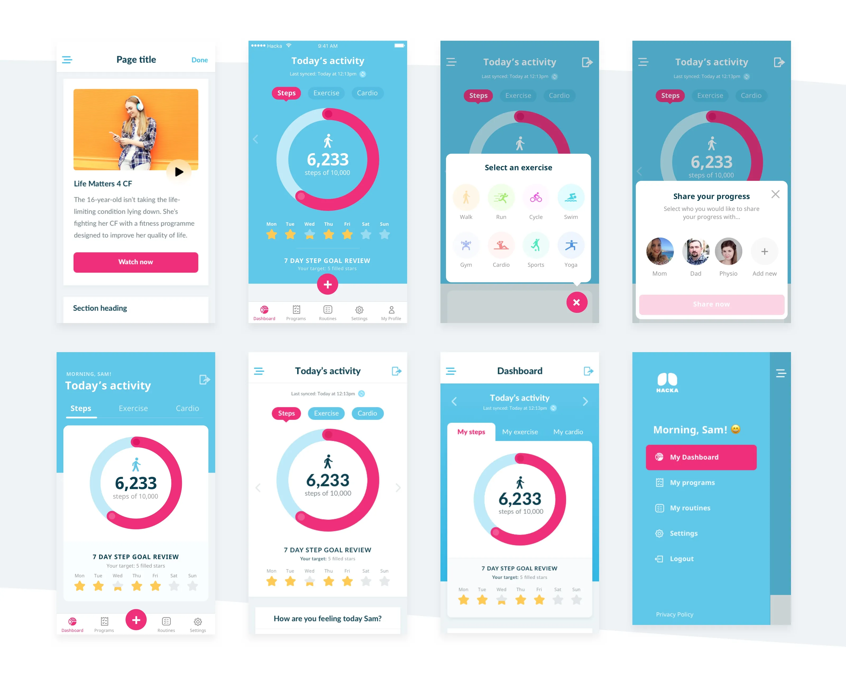
What we shipped
Working closely with the team over the following months, we delivered a full overhaul of the app. We set goals of making the app simple, fun, and engaging — and we achieved that.
We reconstructed all of the signup and onboarding flows, simplified creating routines and logging exercise & activity, added a new Inbox feature for 1–1 communication between parents and physicians, and introduced an all-new visual design language — bringing a much fresher and more fun feel while adhering to the key characteristics we had for the design.
While the TickerFit updates hit the app stores in October 2018, Hacka entered a trial period with clinics in the US. From there, we shifted focus to how we could make the experience better for parents and physicians.
My learnings
This project has been one of my favourite projects since I began my career.
Every designer has a goal to deliver positive change in users' lives — to really help make a difference. But when that work can have a real-life improvement on a person, either supporting an elderly person at home or helping stop a CF sufferer from ending up in hospital for weeks on end — it has been an absolute pleasure to work towards solving these problems.
This project also helped me solidify how important it is who you work with. When everyone shares the same goal, and passion leads you in the right direction, positive results are inevitable.
For any designer reading this — understand your own goals & values, and work with people who also share them.