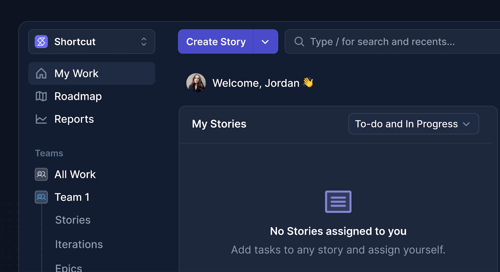
Simplifying the Shortcut Interface
In early 2025, Shortcut launched a rebrand with new colours, updated typography, and a refreshed tone. This effort sparked a complete rethinking of the product UI. We heard from customers that the app's visual design was starting to feel dated, noisy, and unclear. The key issues: a bloated interface, inconsistent hierarchy, and disparate visual languages across different sections.
The redesign prioritised making colour functional rather than merely decorative — reducing visual noise while supporting focus and clarity.
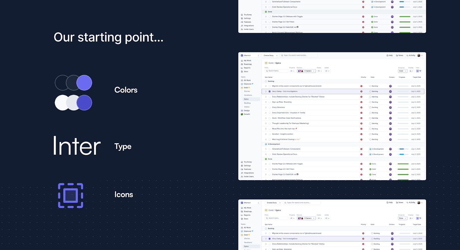
Designing, learning, adjusting
Rather than releasing everything at once, we chose an iterative approach. The process began with visual explorations of colour, typography, and spacing. After initial alignment, we built a prototype and tested it internally.
Work was divided into manageable pieces: the app header and navigation first, followed by page layouts, then feature-level updates like story creation, kanban boards, backlogs, and roadmaps. This prevented workflow disruption while enabling teams to experience changes in their daily use.
Internal feedback loops revealed immediate wins and areas needing refinement. We adjusted spacing, swapped icons, and modified transition speeds based on actual usage patterns rather than theoretical design decisions.
Shaped by those who use it
We invited early users to test and provide feedback. Once confident in the direction, we opened the rollout to all customers — letting them opt into the new look. The response was strong: 77% of users opted in and stayed.
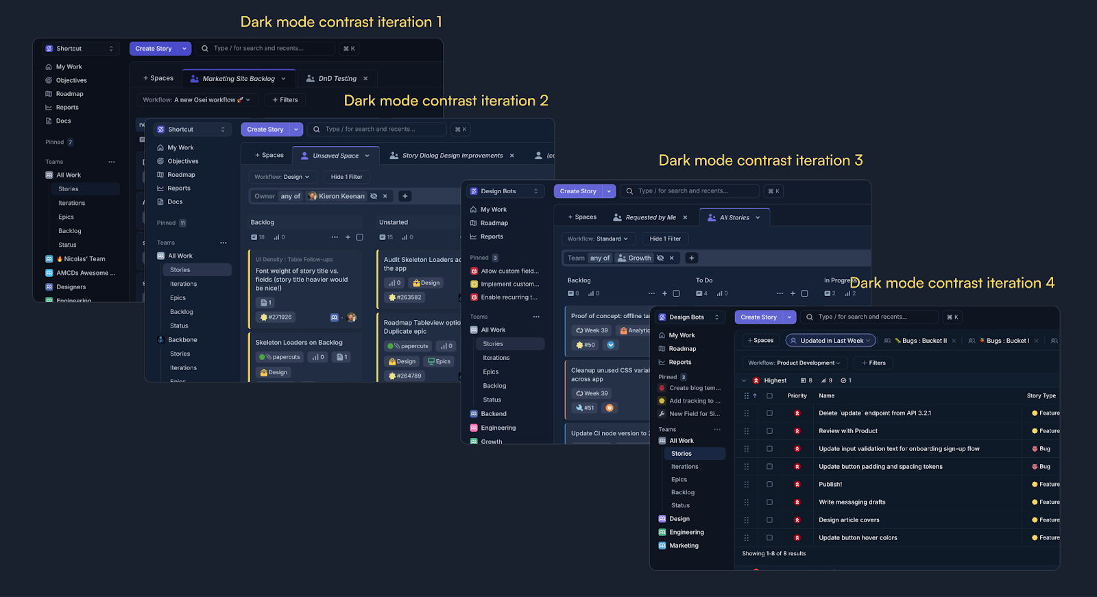
Colour emerged as the most discussed aspect. Surveys and conversations with over a hundred respondents revealed that dark mode contrast needed refinement. We quickly adjusted the palette and shipped updates, receiving a much more positive response afterward.
Looking ahead
Shortcut remains committed to evolving based on community feedback. We recently launched Korey, an AI product management tool that integrates with Shortcut — with the new UI providing a foundation for shared experiences across both products.
The redesign reflects where the company is now and where it's going. We're always open to feedback through in-app channels and beyond.